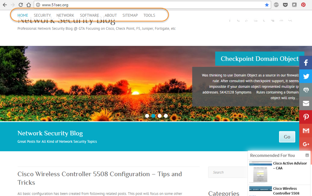
 Attitude Theme has been used for my Wordpress site http://51sec.org. It is powerful and simple to use.
here are some introduction about this theme from its website:
"Attitude is a Simple, Clean and Responsive Retina Ready WordPress Theme which adapts automatically to your tablets and mobile devices. Theme is easily customizable with numerous theme options via Customize. Some of the highlighted options are two site layout (Narrow and Wide), 5 layouts for every post/page, 5 Page Templates, 5 widget areas, 4 custom widgets, featured slider to highlight your post/page, 11 social icons and many more. Also has custom background, header, menu, favicon, CSS, webclip icon, and logo. Supports popular plugins like Breadcrumb NavXT, WP-PageNavi and Contact Form 7. It is also translation ready. Available Translation: Traditional Chinese (Taiwan), Spanish, Norwegian (Nynorsk), German, Russian, Dutch, Italian and Danish. Get free support on http://themehorse.com/support-forum/"
In original theme, the menu bar was not placed in the right place I would like to. It located between site site logon and header image. I figured out to use some simple CSS codes to manipulate it.
1. Move it to above the header image using absolute position and 105px from the top.
#access {
position: absolute;
width: 100%;
z-index: 100;
}

.hgroup-wrap {
background-color: #fff;
top: 0;
}
#access {
top: 105px;
}
2. Move it to top and fixed in the window even scroll the page
#access {
position: fixed;
width: 100%;
z-index: 100;
background-color: #ffffff;
}

.hgroup-wrap {
background-color: #fff;
top: 0;
}
#access {
top: 0px;
}
3. Make Menu Bar Smaller, 90% Opacity and without border
#access {
position: fixed;
width: 100%;
z-index: 100;
background-color: #ffffff;
background: rgba(255, 255, 255, 0.9);
border: 0 none;
}

.hgroup-wrap {
background-color: #fff;
top: 0;
}
#access {
top: 0px;
}


#access a {
    padding-top: 10px;
    height: 30px;
}
.page-title-wrap {
    padding: 10px 0;
}
4. Make Submenu Touch Horizon Menu
There was a problem to click the submenu. Each time when mouse moved out horizon menu area, submenu disappeared right away. Finally I found that was because my submenu is too far from horizon menu.
margin-top: -25px brought submenu ul to touch the menu ul and padding-top: 5px pushed the first Li 5px down.
#access {
position: fixed;
width: 100%;
z-index: 100;
background: #FFFFFF;
background: rgba(255, 255, 255, 0.9);
border: 0 none;
}

.hgroup-wrap {
background-color: #fff;
top: 0;
}
#access {
top: 0px;
}


#access a {
    padding-top: 8px;
    height: 26px;

}
.page-title-wrap {
    padding: 8px 0;
}

#access li:hover ul {
    display: block;
    margin-top: -25px;
    padding-top: 5px;
    }


No comments:
Post a Comment